

R Visualizations Derive Meaning from Data 1st edition David W. Gerbing – Ebook PDF Instand Download/DeliveryISBN: 9780429894916, 0429894910
Full dowload R Visualizations Derive Meaning from Data 1st edition after payment
Product details:
ISBN-10 : 0429894910
ISBN-13 : 9780429894916
Author: David W. Gerbing
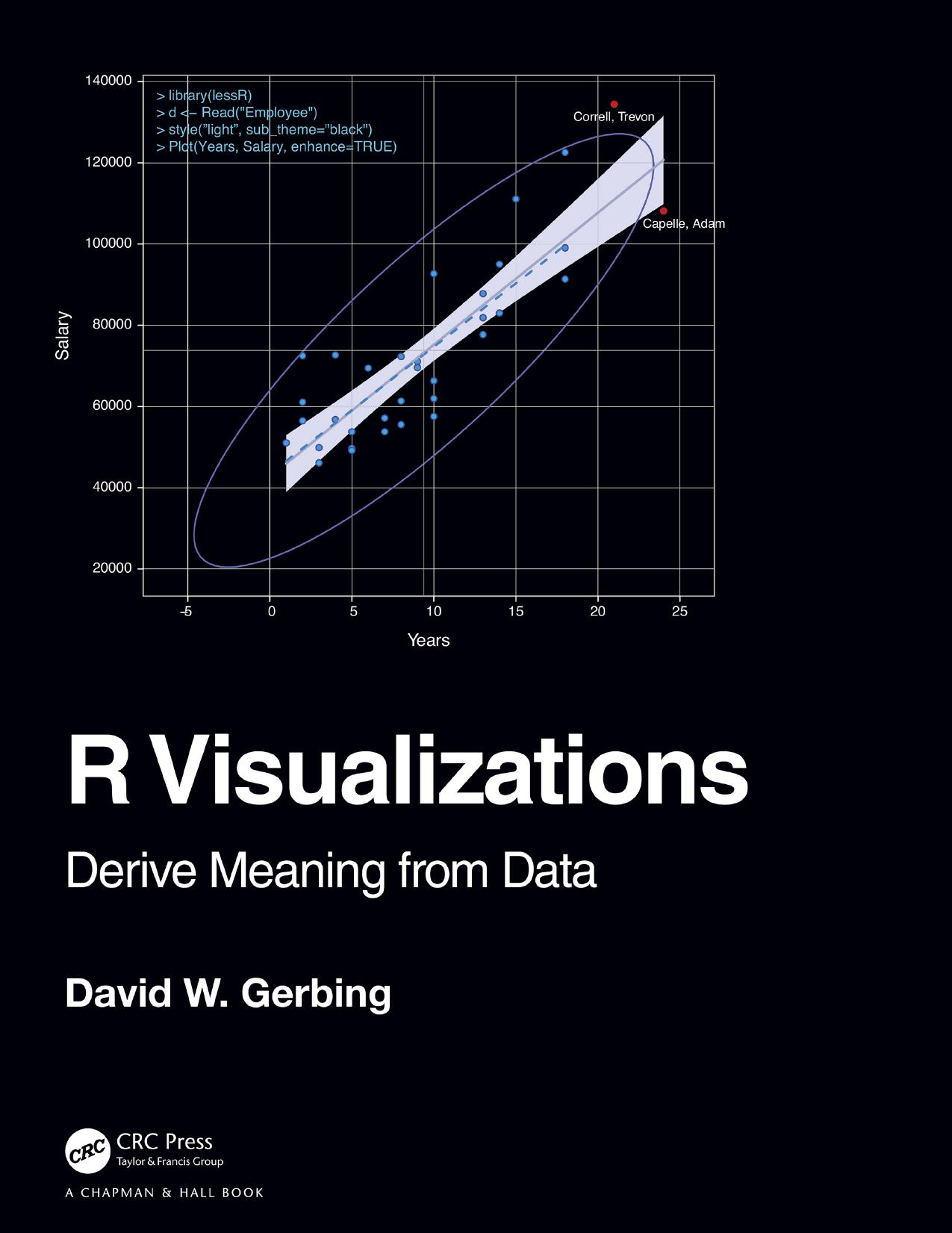
R Visualizations: Derive Meaning from Data focuses on one of the two major topics of data analytics: data visualization, a.k.a., computer graphics. In the book, major R systems for visualization are discussed, organized by topic and not by system. Anyone doing data analysis will be shown how to use R to generate any of the basic visualizations with the R visualization systems. Further, this book introduces the author’s lessR system, which always can accomplish a visualization with less coding than the use of other systems, sometimes dramatically so, and also provides accompanying statistical analyses.
R Visualizations Derive Meaning from Data 1st Table of contents:
1. Visualize Data
1.1 Introduction
1.1.1 Visualization and Analytics
1.1.2 Open-Source Software for Data Visualization
1.2 Data
1.2.1 R Objects
1.2.2 Employee Data Example
1.2.3 Types of Variables
1.2.4 Read Data
1.2.5 Variable Labels
1.2.6 Categorical Variables as Factors
1.2.7 Save the Data Frame
2. Visualization Quick Start
2.1 Visualization Systems
2.1.1 Relative Advantages of ggplot2 and lessR
2.1.2 Grayscale
2.2 Distribution of a Categorical Variable
2.2.1 Bar Chart of a Single Variable
2.2.2 Bar Charts of Multiple Variables
2.3 Distribution of a Continuous Variable
2.3.1 Default Histogram
2.3.2 Beyond the Histogram
2.4 Relation between Two Variables
2.4.1 Basic Scatterplot
2.4.2 Enhanced Scatterplot
2.5 Distribution of Values over Time
2.5.1 Time Series
2.5.2 Multiple Time Series
3. Visualize a Categorical Variable
3.1 Bars, Dots, and Bubbles
3.1.1 Horizontal Bar Chart of Counts
3.1.2 Cleveland Dot Plot of Counts
3.1.3 Bubble Plot of Counts
3.1.4 Display Proportions
3.2 Multiple Plots on a Single Panel
3.3 Provide the Numerical Values
3.3.1 Bar Chart of Individual Data Values
3.3.2 Vertical Long Value Labels
3.3.3 Cleveland Dot Plot of Individual Data Values
3.3.4 Visualize Means across Categories
3.4 Communicate with Bar Fill Color
3.4.1 Bar Fill Color Bifurcated by Value of Mean Deviations
3.4.2 Bar Chart of an Ordinal Variable
3.4.3 Custom Color for Individual Bars
3.5 Create a Report from Saved Output
3.6 Part-Whole Visualizations
3.6.1 Doughnut and Pie Charts
3.6.2 The Waffle Plot
3.6.3 The Treemap
4. Visualize a Continuous Variable
4.1 Histogram
4.1.1 Binning Continuous Data
4.1.2 Histogram Artifacts
4.1.3 Cumulative Histogram
4.1.4 Frequency Polygon
4.2 Density Plot
4.2.1 Enhanced Density Plot
4.2.2 Overlapping Density Curves
4.2.3 Rug Plot
4.2.4 Violin Plot
4.3 Box Plot
4.3.1 Classic Box Plot
4.3.2 Box Plot Adjusted for Asymmetry
4.4 One-Variable Scatterplot
4.5 Integrated Violin/Box/Scatterplot
4.5.1 VBS Plot
4.5.2 VBS Plot of Likert Data
4.5.3 Trellis Plots or Facets
4.6 Pareto Chart
5. Visualize the Relation of Two Continuous Variables
5.1 Enhance the Scatterplot
5.1.1 The Ellipse
5.1.2 Line of Best Fit
5.1.3 Annotate
5.2 Consideration of a Third Variable
5.2.1 Map Data from a Grouping Variable to Aesthetics
5.2.2 Trellis (Facet) Scatterplots
5.2.3 Map a Third Continuous Variable into a Visual Aesthetic
5.2.4 Plot Multiple Variables on the Same Panel
5.3 Inter-Relations of a Set of Variables
5.3.1 Scatterplot Matrix
5.3.2 Heat Map of a Correlation Matrix
5.4 Scatterplots for Large Data Sets
5.4.1 Smoothed Scatterplots
5.4.2 Contoured and Hex-Binned Scatterplots
6. Visualize Multiple Categorical Variables
6.1 Two Categorical Variables
6.1.1 Stacked Two-Variable Bar Chart
6.1.2 Unstacked Two-Variable Bar Chart
6.1.3 Trellis Plots or Facets
6.2 Other Styles for the Two-Variable Bar Chart
6.2.1 Sorted Two-Variable Bar Chart
6.2.2 Horizontal Bar Chart
6.2.3 Bar Chart with Legend on the Top
6.2.4 100% Stacked Bar Chart
6.2.5 Bar Chart of Means across Two Categorical Variables
6.2.6 Two-Variable Cleveland Dot Plot
6.2.7 Paired t-test Visualization
6.3 Mosaic Plots and Association Plots
6.3.1 The Mosaic Plot
6.3.2 Independence and Pearson Residuals
6.3.3 The Association Plot
7. Visualize over Time
7.1 Run Chart and Control Chart
7.1.1 Run Chart
7.1.2 Control Chart
7.2 Time Series
7.2.1 Filled Area Time Series
7.2.2 Stacked Multiple Time Series
7.2.3 Formatted Multi-Panel Time Series
7.2.4 Data Preparation for Date Variables
7.3 Forecasts
7.3.1 Time-Series Object
7.3.2 Seasonal/Trend Decomposition
7.3.3 Generate a Forecast
8. Visualize Maps and Networks
8.1 Maps
8.1.1 Map the World
8.1.2 Raster Images
8.1.3 Online Geocode Databases
8.1.4 Create a Country Map with Cities
8.1.5 Choropleth Map
8.2 Network Visualizations
8.2.1 Network Data
8.2.2 Visualizations
8.2.3 Network Analysis
9. Interactive Visualizations
9.1 Interactive Visualizations with Shiny
9.1.1 Static vs. Interactive Visualizations
9.1.2 Shiny Overview
9.2 Running a Shiny App
9.2.1 Shiny within RStudio
9.2.2 Publish Shiny Apps on the Web
10. Customize Visualizations
10.1 Color References
10.1.1 Describe Colors
10.1.2 Parameters fill and color
10.2 Palettes
10.2.1 Qualitative Palettes
10.2.2 Sequential Palettes
10.2.3 Divergent Palettes
10.3 Themes
10.3.1 Persistent Theme
10.3.2 Theme Applied to Current Visualization
10.4 Customize Individual Characteristics
10.4.1 List of Individual Characteristics
10.4.2 Customize a Single Analysis
10.4.3 Update and Save a Persistent Theme
10.4.4 Custom Margins
People also search for R Visualizations Derive Meaning from Data 1st:
visualize data meaning
visualization description
a visualization
a visual representation of data
data visualization define